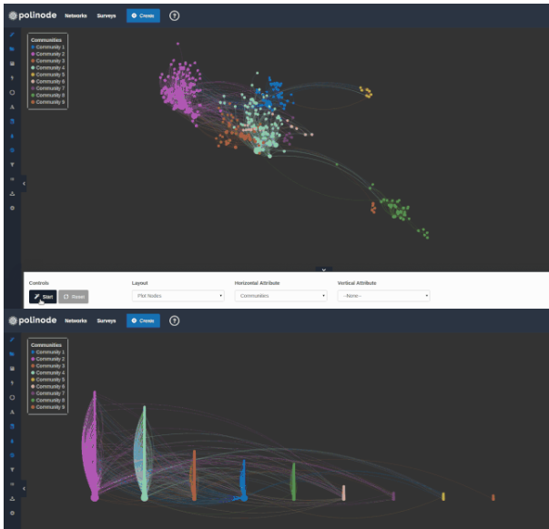
1. Visualizing networks.
@Polinode builds innovative tools for network analysis. One nifty feature allows creation of column charts using a set of nodes. A recent post explains how to use calculated network metrics such as centrality or betweenness.
2. Analytics are disconnected from strategic decisions.
An extensive study suggests analytics sponsors are in the trough of disillusionment. The new MIT Sloan-SAS report, Beyond the hype: The hard work behind analytics success finds that competitive advantage from analytics is declining. How can we do more with data to improve outcomes?
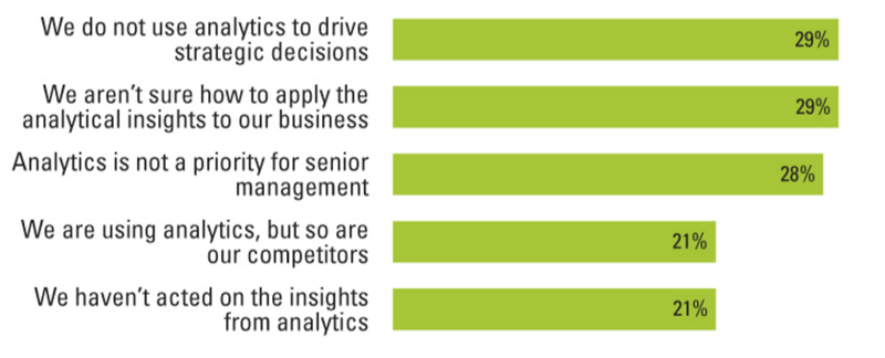
The @mitsmr article notes several difficulties, including failure to drive strategic decisions with analytics. “Over the years, access to useful data has continued to increase, but the ability to apply analytical insights to strategy has declined.” Dissemination of insights to executives and other decision makers is also a problem. The full report is available from SAS (@SASBestPractice).
3. Evidence shows graphics better than bullets.
There’s new empirical evidence on communicating business strategy. 76 managers saw a presentation by the financial services branch of an auto manufacturer. Three types of visual support were displayed: bulleted list, visual metaphor, and temporal diagram. Each subject saw only one of the three formats. Those who saw a graphical representation paid significantly more attention to, agreed more with, and better recalled the strategy than did subjects who saw a (textually identical) bulleted list version. However, no significant difference was found regarding the *understanding* of the strategy. Also, presenters using graphical representations were more positively perceived those who presented bulleted lists.
4. Linking customer experience with value.
McKinsey’s Joel Maynes and Alex Rawson offer concrete advice on how to explicitly link customer experience initiatives to value. “Develop a hypothesis about customer outcomes that matter. Start by identifying the specific customer behavior and outcomes that underpin value in your industry. The next step is to link what customers say in satisfaction surveys with their behavior over time.”
5. Never mind on that reproducibility study.
Slate explains how Psychologists Call Out the Study That Called Out the Field of Psychology. In a comment published by Science, reviewers conclude that “A paper from the Open Science Collaboration… attempting to replicate 100 published studies suggests that the reproducibility of psychological science is surprisingly low. We show that this article contains three statistical errors and provides no support for such a conclusion. Indeed, the data are consistent with the opposite conclusion, namely, that the reproducibility of psychological science is quite high.” Evidently, OSC frequently used study populations that differed substantially from the original ones – and each replication attempt was done only once.
Posted by Tracy Allison Altman on 10-Sept-2016.