To be inspired, your audience needs to see how findings are reliable and relevant. Part 1 talked about creating practical checklists to ensure data-driven research is reproducible. This post describes how to deliver results that resonate with your audience.
It’s nice when people review analytical findings, think “Hmmm, interesting,” and add the link to bitly. It’s exponentially nicer when they say “Holy smokes, let’s get started!” Certainly there are big differences between publishing a report, populating an executive dashboard, and presenting face-to-face. But these three techniques can be applied in many settings.
1. Avoid navel-gazing. Regardless of how elegant the analytics are, if your audience doesn’t understand what they might do with them, your efforts won’t have impact. All of us must resist the urge to overemphasize our expertise and hard work, and focus on helping others achieve more. Ask yourself which insights can help someone grow their business, improve team performance, or create social good.
2. Show relationships explicitly. Now more than ever, organizations urgently need *actionable insights* rather than findings. Of course you won’t always know people’s potential actions or decisions; addressing them directly can make you sound presumptuous, or just plain wrong. But you should know the subject matter well enough to anticipate objectives, values, or priorities. Be sure to connect to outcomes that are meaningful: Whenever possible, include a simple illustration, so people see key relationships at a glance.
Example: Before. Writeup of results (paragraphs or bullet points). “Patient engagement enables substantial provider cost savings. In a recent RCT, interactive, web-based patient engagement cut sedation needs 18% and procedure time 14% for first-time colonoscopy patients.”
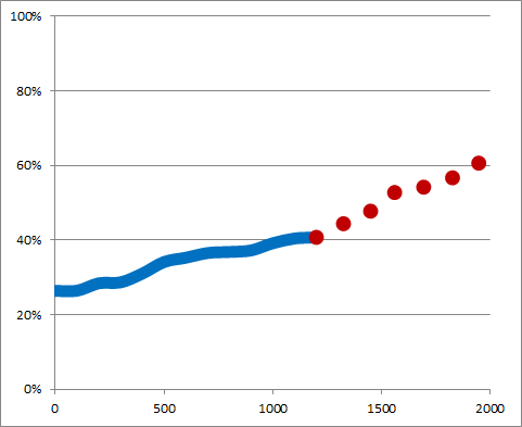
Example: After. Use a simple illustration of associations, cause-effect, or before-after data relationships.
Interactive colonoscopy education → 14% faster procedures
EMMI offers an excellent example in this writeup of patient engagement research. Note how they name-drop respected medical centers doing a randomized, controlled trial – but quickly shift to simple, powerful visuals and descriptions of the business problem, evidence, and value message. (Bonus points for this Vimeo.)


3. Build a better dashboard.
Data visualizations on dashboards effectively show what’s happening now, or what already happened. But when you are in a position to specifically advise decision makers, more is required. This spot-on observation by James Taylor (@jamet123) at Decision Management Solutions says it well: “Dashboards are decision support systems, but paradoxically, their design does not usually consider decisions explicitly.”
Example: Before. Graphics can indeed be worth 1,000 words, but simple information feeds and routine forecasts are a commodity.
Example: After. Decision makers need predictions and recommendations/prescriptive analytics. Most powerful are insights into the expected outcomes from untried, hopefully curve-bending or needle-moving activities. Some innovative variations on the standard dashboard are:
– List of specific decisions that could influence the numbers being predicted.
– List of actions that have influenced the numbers being displayed.
– Environment where people can do what-ifs and think through different operational decisions. Formalizing this in a dashboard isn’t realistic for every organization. Accenture provides excellent perspective on industrializing the insight-action-outcome sequence.
Posted by Tracy Allison Altman on 25-Nov-2016.


